I must begin this review with a disclaimer that I am definitely not the decorator kind. I’ll take practical over pretty any day, and that applies to a variety of things in my life – ranging from clothing to home decor. So, the only reason I picked up this book was because (a) the author a popular blogger, and (b) I was bored of how our < 1000 sq.ft. rental apartment looked.
Now on to the review!
The Nesting Place: It Doesn’t Have to Be Perfect to Be Beautiful by Myquillyn Smith was a surprising read for this non-creative, reluctant homemaker. The fact that the author had moved 13 times (to mostly rental homes) and still managed to make her living space look beautiful gave me some hope.
The book is filled with lovely color photos of the author’s home (which looks real & lived in… not like a museum, by the way). And the author’s advice to take risks with home decor (even in a rental home) was very liberating.
Here’s a quote from the book that I’ll be applying in more areas than just my home:
“At times, good enough and done is a smarter choice than perfect, and simply making a choice is often a sign of maturity, balance, and contentment.”
This is not just a home decorating book. It does not just have lovely pictures of the author’s home. It does not just give you practical ideas to make the most of what you have.
This book taught me contentment, allowing me to appreciate my dwelling place. And above all, it gave me hope that I too can make my home look beautiful, even with its imperfections.
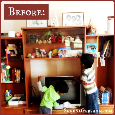
I never put much effort into decorating our home because it was a rental. Coincidentally, while I was reading this book, my husband and I were also thinking of changing the look of our living room. We had a huge entertainment center right in the middle of our living room that housed our television, DVD player, music system, photo frames, books, medals, and a variety of knickknacks.
The only problem was that it occupied a large central portion of our living room, and all the other furniture was ‘bowing down’ to the TV. My husband had this crazy idea to saw off a part of the shelving and push the rest of it to a corner of the room.
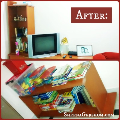
I usually don’t take much action on crazy ideas, but The Nesting Place kind of gave me the courage to try something new. I had another wild idea (to add to my husband’s)… I suggested we take the sawed off portion of the shelving, remove the glass dividers and lay it down horizontally in the kids’ room – to hold their books, blocks, puzzles and stationery.
So that’s what we did!
The top half of the picture is our current entertainment center, pushed to a side of the living room. Our TV is no longer the center of attention. The couches (and the people sitting on them are). And there is more breathing space in the living room, making it appear much larger than it is.
The bottom half of the after picture, is the shelf laid down on it’s side in our kids’ room. All their stuff is now relegated to one corner of the room. Score!
So happy we took the risk and sawed up our entertainment center to make our living space look & feel better. Thank you Nester! 🙂
Disclosure: I received a free Kindle version of this book from the publisher through the BookLook Bloggers book review bloggers program. I was not required to write a positive review. The opinions I have expressed are entirely my own.
—————————————————————————————————————————
Sign up here to have new blog posts delivered directly to your email inbox.
You can also follow along on Facebook and Twitter.
—————————————————————————————————————————


The Space is looking lovely….now i need to physically visit to say it!!!!!
Thank you! And yes… a visit is long due! 🙂